


Hoolis: storefront performance revamp for higher conversion

About Hoolis
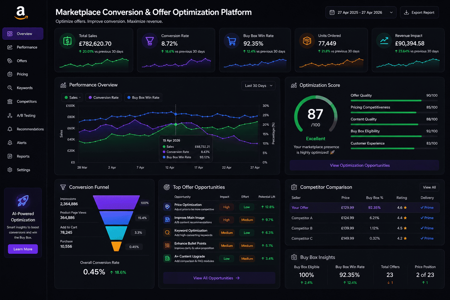
Hoolis had demand, traffic, and a product catalog that deserved stronger commercial performance than the storefront was delivering. Visitors were landing, browsing, and leaving without a clear reason to commit, which meant the brand was working too hard to earn every sale.
The challenge was not purely aesthetic. The site needed a more disciplined conversion structure so messaging, merchandising, and purchase flow could work together instead of competing for attention.
Why the storefront was underperforming
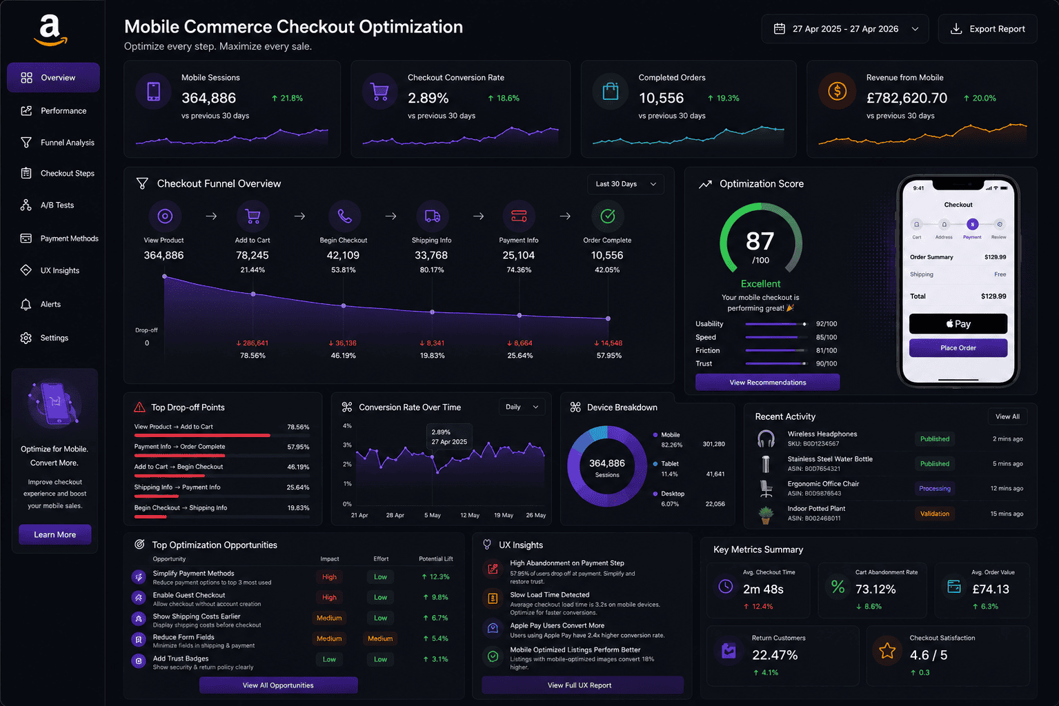
The original experience had too many weak decision points. Product value was not communicated quickly enough, category pathways lacked hierarchy, and important trust-building elements were either buried or disconnected from the buying journey.
That created friction at multiple levels. New visitors could not immediately understand the offer, returning users were not being guided toward higher-intent actions, and the storefront was missing the kind of clarity that supports stronger conversion efficiency from paid traffic.
- Unclear above-the-fold messaging was slowing first impressions.
- Category flow did not prioritize the strongest buying journeys.
- Retention cues were too weak for repeat customer momentum.
What we changed
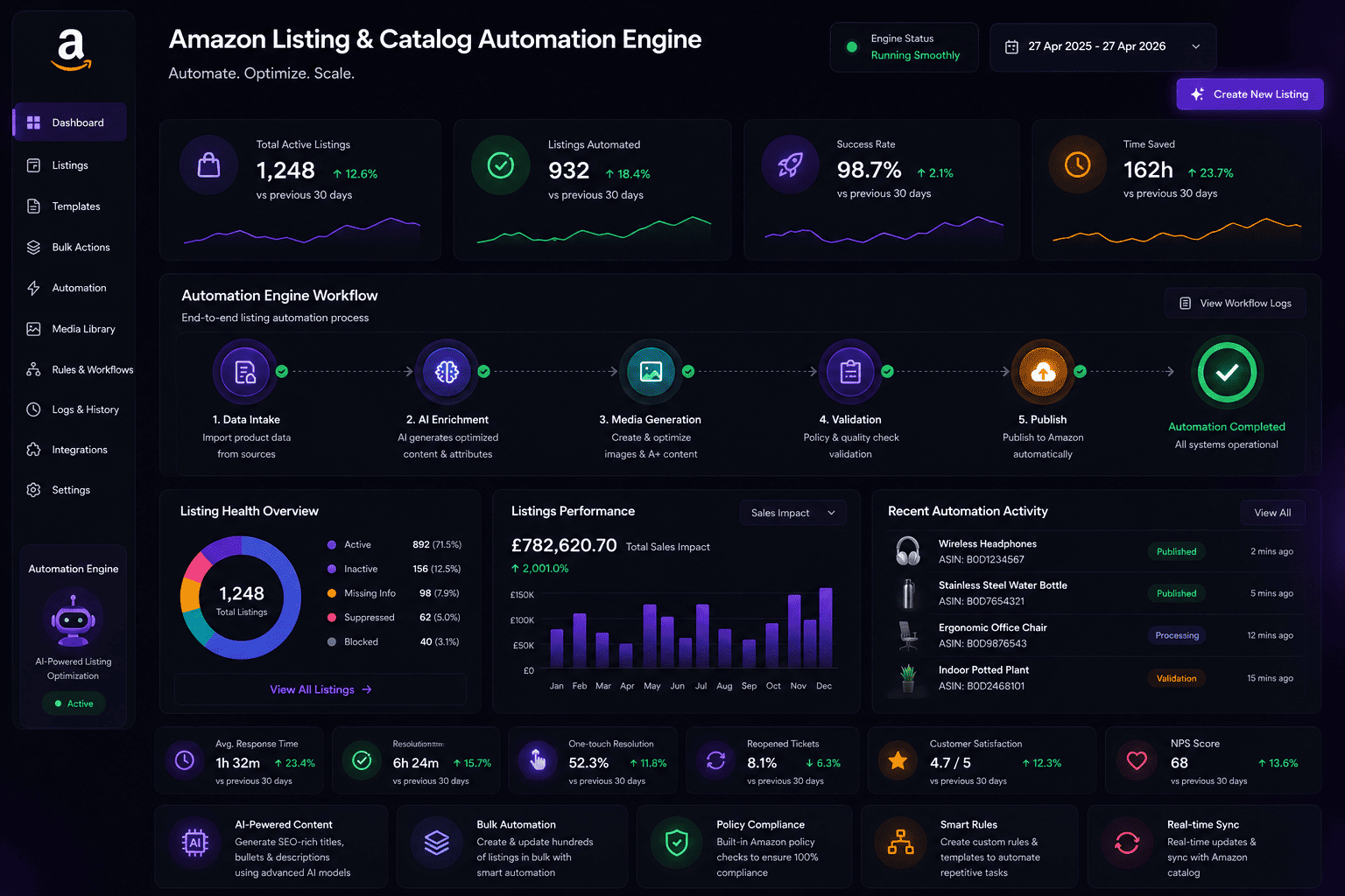
Emjeez rebuilt the storefront around buying intent. We tightened headline structure, simplified key decision moments, and clarified how products should be grouped and sequenced so the site could guide people toward action rather than simply display inventory.
We also reframed the offer architecture to support better merchandising. Product pages, supporting content, and conversion cues were aligned more deliberately so the customer journey felt easier to understand and more credible at every step.
From navigation cleanup to conversion strategy
The work went deeper than page-level edits. We looked at how traffic would move through the storefront, where hesitation was strongest, and how to reduce unnecessary cognitive load for visitors coming from ads, branded search, and repeat sessions.
This meant improving the relationship between discovery, evaluation, and purchase. Instead of forcing the user to piece the offer together, the storefront started doing more of the selling through structure, priority, and relevance.
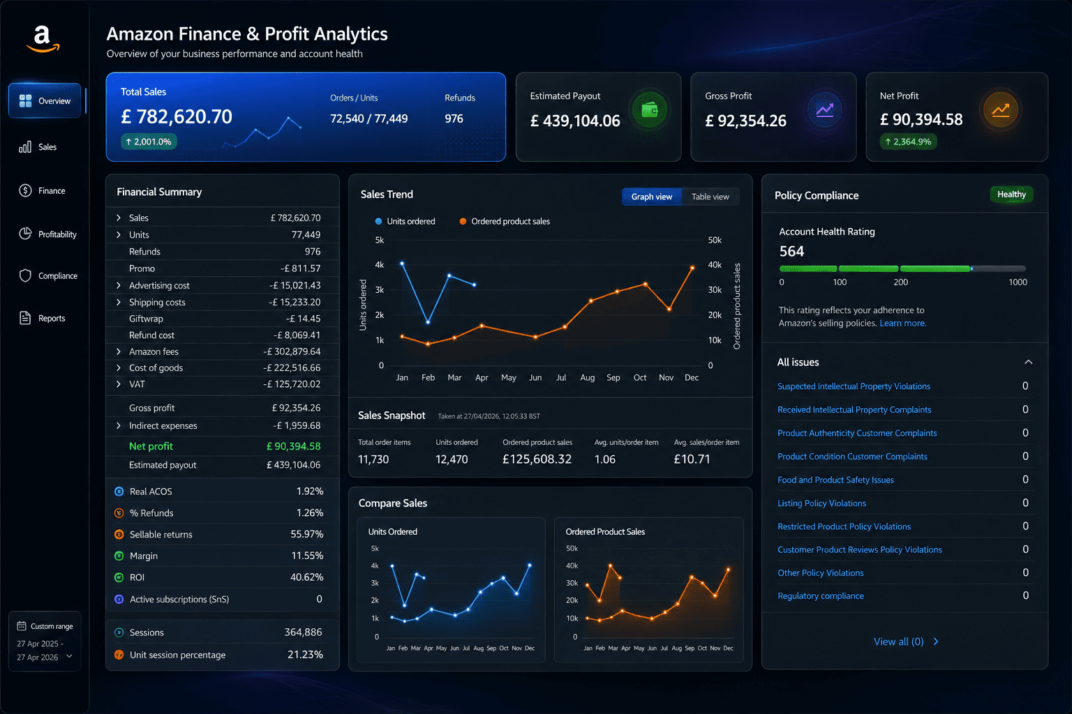
Business impact
After the revamp, Hoolis had a storefront that felt more confident commercially and easier to convert through. Product communication became faster to grasp, navigation felt more intentional, and the brand could extract more value from existing traffic without relying on aggressive discounting.
The broader win was operational clarity. The team had a stronger base for future testing, more confidence in how the site should evolve, and a clearer connection between merchandising decisions and revenue performance.
Turn your ideas into impactful solutions like them!
Have a Project? Let’s talk!


"Our storefront became clearer, faster, and easier to convert from. Revenue per visitor improved in the first optimization cycle."